


Explore Design E-books
Find books on business, technology, and design:
- Access O'Reilly directly, or through the W&L Library Catalog or A-Z Database List
- To access: Select "Washington and Lee University" from the drop-down menu and type in your W&L email address.
 To find resources on design
- Select "Explore Skills" on the top left portion of the screen.
- Choose "Design."
"Graphic Design" includes a variety of materials on visual communication, such as: White Space Is Not Your Enemy, The Complete Manual of Typography, and Fundamentals of Data Visualization.
Principles and Elements of Design
Good design makes academic posters, infographics, and other visual materials more effective. Strong designs apply fundamental elements (line, shape, form, color, value, space, texture) and principles (balance, emphasis, movement, repetition, rhythm, proportion, variety, unity).
For many students, choosing colors and fonts can be especially challenging. For example, an understanding of elements like line, shape, and form underpins the selection of font.
For more guidance, explore: Berkeley Library’s Design Fundamentals Guide, and browse the provided resources on color theory and typography.
Color
According to Rhyne's (2016) Applying Color Theory to Digital Media and Visualization, "[C]olor is both a psychological and physiological response to light waves of specific frequencies that strike our eyes." (17).
Some may choose colors intuitively, but understanding color theory and color perception helps designers communicate information more effectively.
Note: Color theory should be balanced with accessibility.
Learn more:
-
 Applying Color Theory to Digital Media and Visualization
by
This book provides an overview of the application of color theory concepts to digital media and visualization. It highlights specific color concepts like color harmony and shows how to apply the concept with case study examples and usage of actual online and mobile color tools. Color deficiencies are reviewed and discussed are color tools for examining how a specific color map design will look to someone with the deficiency. Other books on color examine artists' use of color, color management, or color science. This book applies fundamental color concepts to digital media and visualization solutions...
Call Number: EbookISBN: 9781315380384Publication Date: 2016
Applying Color Theory to Digital Media and Visualization
by
This book provides an overview of the application of color theory concepts to digital media and visualization. It highlights specific color concepts like color harmony and shows how to apply the concept with case study examples and usage of actual online and mobile color tools. Color deficiencies are reviewed and discussed are color tools for examining how a specific color map design will look to someone with the deficiency. Other books on color examine artists' use of color, color management, or color science. This book applies fundamental color concepts to digital media and visualization solutions...
Call Number: EbookISBN: 9781315380384Publication Date: 2016 -
 The Art of Color Categorization
by
From the publisher, "Building upon this foundation, this book aims to explore the rich and varied examples of color theory through two basic concepts: categorizing colors themselves and categorizing things by color. How have different cultures drawn the line between colors, and why? What do these divisions reveal about color naming, standards, environments, and sensory perceptions?"
Call Number: EbookISBN: 9783031476907Publication Date: 2024
The Art of Color Categorization
by
From the publisher, "Building upon this foundation, this book aims to explore the rich and varied examples of color theory through two basic concepts: categorizing colors themselves and categorizing things by color. How have different cultures drawn the line between colors, and why? What do these divisions reveal about color naming, standards, environments, and sensory perceptions?"
Call Number: EbookISBN: 9783031476907Publication Date: 2024

Font
Oxford English Dictionary defines font as "a set of type of a particular size, weight, and style (such as roman, italic, bold, etc.), forming part of a type family." The intentional selection of fonts can impact the formality, tone, and readability of a final product.
Learn more:
-
 Giving Type Meaning
by
From the Bloomsbury, "The book includes:
The importance of cultural and social values and context.
Using visual, gestural, and physical space
How time impacts type – looking at both historical context and using time as a medium.
A wide range of non-Latin examples from Kanji characters, Thai scripts, and Devanagari scripts to Arabic calligraphy."
Call Number: EbookISBN: 9781350255869Publication Date: 2024
Giving Type Meaning
by
From the Bloomsbury, "The book includes:
The importance of cultural and social values and context.
Using visual, gestural, and physical space
How time impacts type – looking at both historical context and using time as a medium.
A wide range of non-Latin examples from Kanji characters, Thai scripts, and Devanagari scripts to Arabic calligraphy."
Call Number: EbookISBN: 9781350255869Publication Date: 2024 -
 Type Specimens: A Visual History of Typesetting and Printing
by
From Bloomsbury, "Fully illustrated throughout with 200 color images of type specimens and related ephemera, the book illuminates the broader history of typography and printing, showing how letterforms and their technologies have evolved over time, inspiring and guiding designers of today."
Call Number: EbookISBN: 9781350116634Publication Date: 2022
Type Specimens: A Visual History of Typesetting and Printing
by
From Bloomsbury, "Fully illustrated throughout with 200 color images of type specimens and related ephemera, the book illuminates the broader history of typography and printing, showing how letterforms and their technologies have evolved over time, inspiring and guiding designers of today."
Call Number: EbookISBN: 9781350116634Publication Date: 2022 -
 Visualizing with Text
by
Visualizing with Text uncovers the rich palette of text elements usable in visualizations from simple labels through to documents. Using a multidisciplinary research effort spanning across fields including visualization, typography, and cartography, it builds a solid foundation for the design space of text in visualization. ...
Call Number: EbookISBN: 9780429290565Publication Date: 2020
Visualizing with Text
by
Visualizing with Text uncovers the rich palette of text elements usable in visualizations from simple labels through to documents. Using a multidisciplinary research effort spanning across fields including visualization, typography, and cartography, it builds a solid foundation for the design space of text in visualization. ...
Call Number: EbookISBN: 9780429290565Publication Date: 2020


Accessibility
Color
Color theory should be balanced with accessibility.
This chart depicts color vision deficiencies that people may experience. Use high color contrast between fonts or images and backgrounds to alleviate these readability issues.
(Color Vision Deficiency)
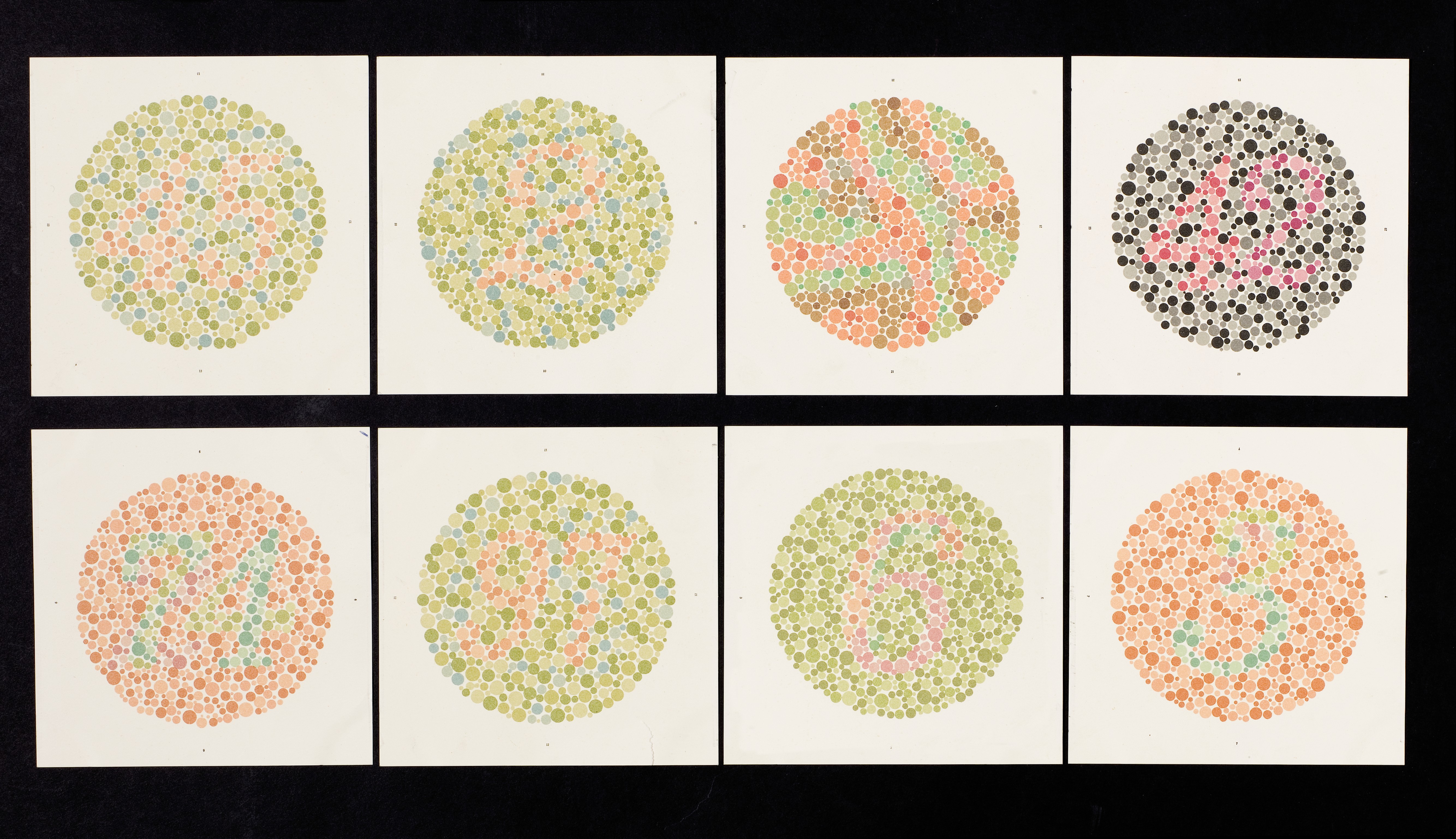
Wellcome Collection gallery. "Eight Ishihara charts..." CC BY 4.0
Color Contrast Checkers
Aim for 4.5:1 contrast ratio for normal text and 3:1 for large text (at least 18pt) or bold text.
-
WebAim Contrast Checker Web-based tool to compare colors using hex codes or an eyedropper tool.
-
Color Contrast Analyzer (Chrome Extension) Most contrast tools assume that text is placed against a solid background. They can’t easily account for text on gradient backgrounds or images. The Color Contrast Analyzer Extension helps to solve this problem, although it only works within Google Chrome. It repaints a web page to show which text fades into the background. If there is an item that is not outlined, then the item does not have sufficient contrast.
-
WAVE Tool (Chrome Extension) Free Chrome extension that has a color contrast checker included. This tool only checks content within a browser. Check the results against WCAG level AA standards.